Glassmorphism: A Failed Attempt at FinTech Futurism
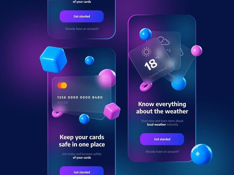
tl;dr: Glassmorphism is a design style that combines all of the uses of the “frosted glass” effect in the UI. Below are the pictures of glassmorphism UI to get an idea of what I'm talking about.
Glassmorphism is a design style that combines all of the uses of the “frosted glass” effect in the UI.
Below are the pictures of glassmorphism UI to get an idea of what I’m talking about.
Glassmorphism - Dribble


I’m pretty sure you’ve seen them somewhere as these designs styles were the hottest trend in the last three years even though this kind of style exited long ago.
The rise of Glassmorphism
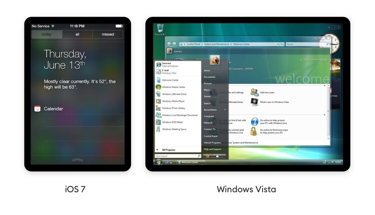
Glassmorphism has been used by many Big Tech companies years ago , in fact Windows used it since 2007 (Windows Vista Menu) and Apple used it back in 2013 with iOS 7

And there’s more cases where big companies used it before as “Frosted Glass” designs,despite this, Glassmorphism did not gain widespread popularity until more recently.
In 2021, Glassmorphism saw a sharp increase in popularity. Reference : Glassmorphism : UI Design trend for 2021 ? Is Glassmorphism A Trend For UI Developers In 2021? The UI Design Trend of 2021
Notice the spike in 2021 in the Google trends graph  Google Trends graph for “Glassmorphism”
Web3 & Glassmorphism
The increase in popularity of Glassmorphism has to be linked to the rise of Web3 and the desire to showcase the futuristic and next-generation nature .
The web 3 wave needed to demonstrate that it’s the future and that Web 3 is the next generation of web .
As a result , many designers chose this frosted glass design on very shiny and gradient backgrounds in an attempt to highlight their difference from normal web.
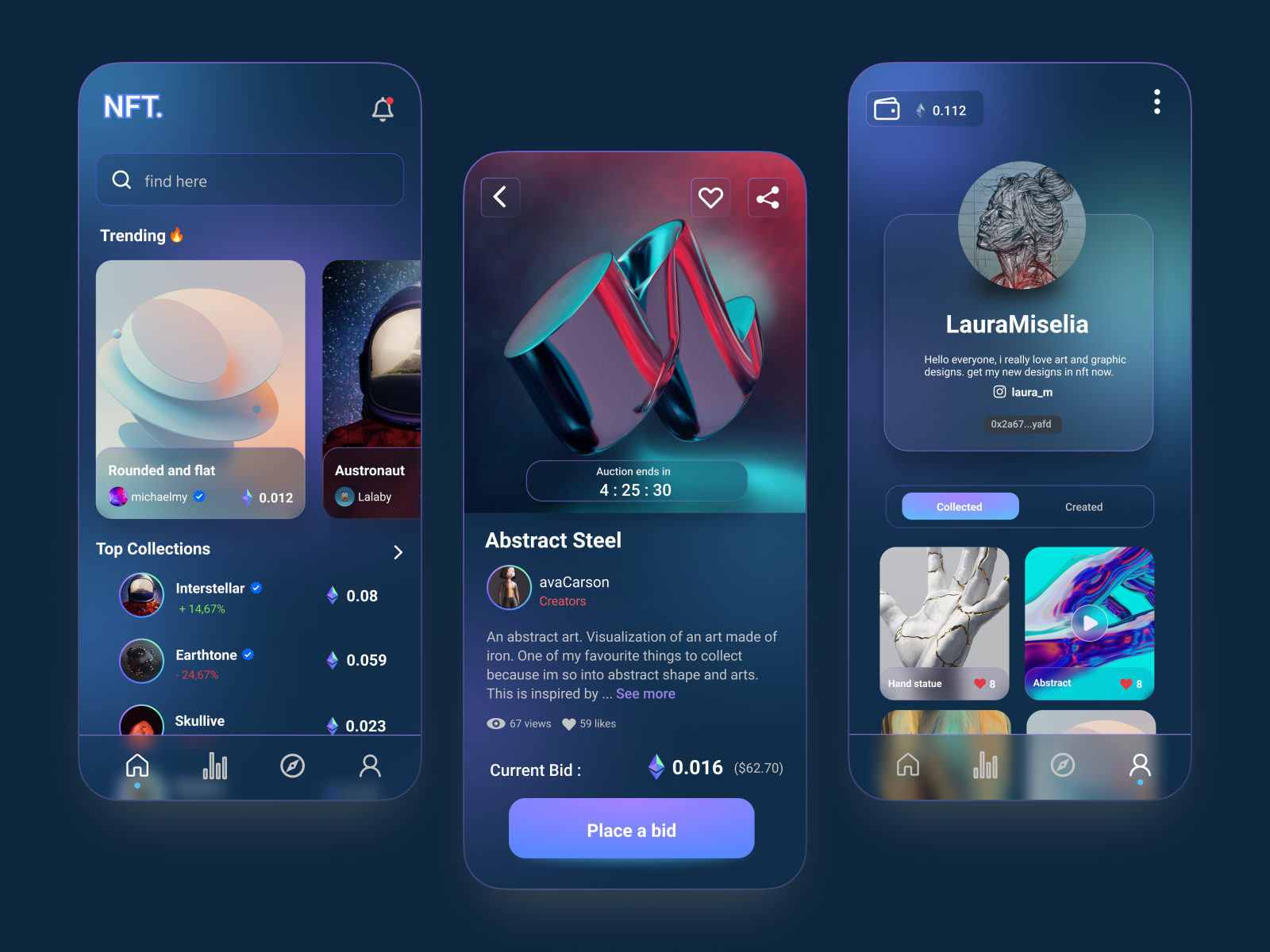
Below are example pictures of NFT app designs:

 Web 3 saw a huge spike in 2021 as well (even the Google Trend graph of Web3 look similar to Glassmorphism graph)
 In that period everyone was hyping it out with the colourful and shiny designs , Glassmorphism played a huge part in most of web3 UI designs.
However , Is it really a good choice for the FinTech Industry?
Glassmorphism in Fintech
The top FinTech apps & Websites like Paypal , Mastercard , Visa etc.. didn’t integrate Glassmorphism in any of their UIs.
Even though Payonner made a complete brand redesign in 2022 ,They didn’t have a single Glassmorphism effect in their UIs.
Many of other big FinTech startups integrated Glassmorphism in their User Interfaces but all of these integrations are very small.
These are top websites in FinTech Industry that uses Glassmorphism lightly :
- Revolut : Navbar only and keeping the rest of the UI in app as Flat Design.
- Interbank Navbar when hovered only.
- Paysafe News section in their website.
- PayU Glassmorphism in Preview images only but not in the actual app.
And the list goes on , all of these FinTech startup do NOT use glassmorphism in their Apps but only slightly in their landing page .
Even Though , the rise of Glassmorphism in the trends affected Web3 a lot ! successful fintech companies tend to avoid it. A minority of companies went all out with Glassmorphism (App & Website) like VaroBank yet they failed miserably. Varo Bank may run out of funds by year’s end—and additional funding may not be an option Varo, The First Fintech To Receive A National Bank Charter, Now Facing Cash Crunch While the reason behind these companies to fail is not Glassmorphism of course, But it had it’s effect. History shall tell how Bad User Experience is so damaging for a company .
Uses of Glassmorphism
”Frosted Glass” & Transparency is used even in the real world not only in UI design. This design is often found in offices to improve productivity. Glassmorphism in UI is used for higher productivity by Windows , Apple and they use it with very high moderation as showcased above. It is actually very good refreshing effect with a natural feeling if used correctly However , FinTech designs needs to be : Reliable , accessible and most importantly Serious, not too shiny and not too complex. Which opposes the main uses of Glassmorphism,
I personally think that Glassmorphism isn’t that good for web UI design as it doesn’t contribute to minimal and simple design while the Drribbble shots and the pictures we see with the Glassmorphism design looks pretty cool and all but in reality , when applied in the real world it’s not practical at all and I expect this trend to fade away as the crypto and web 3 hype is fading away as well.